
Global Modal Component
Centralized modal system for ClawPlate applications. Provides a flexible modal container with overlay, animations, and accessibility features.
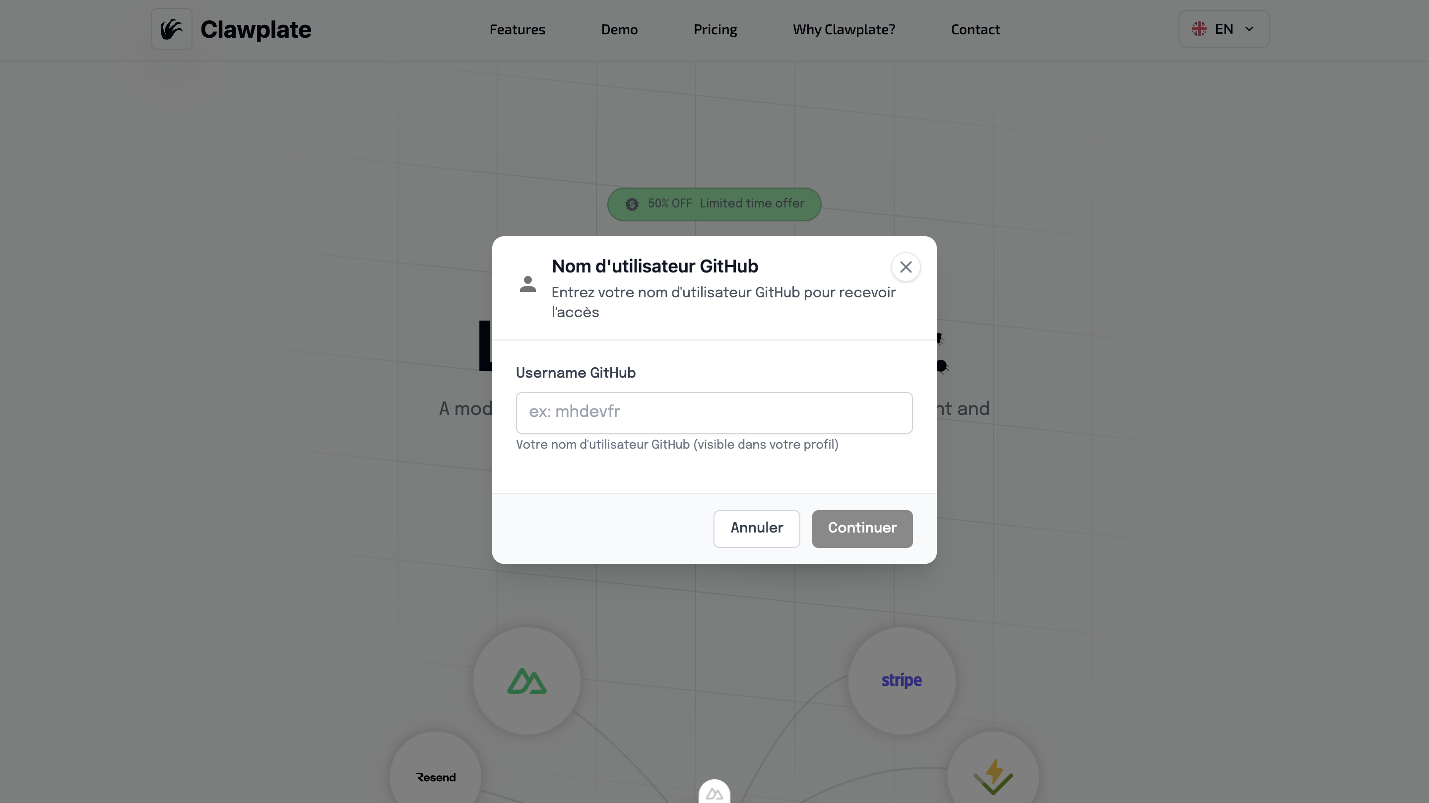
Overview
The GlobalModal component provides a reusable modal system that can be controlled globally throughout your application. It includes proper focus management, escape key handling, and backdrop clicks.
Preview
Basic Usage
The GlobalModal works with the useModal() composable for centralized modal management across your entire application.
vue
<template>
  <div>
    <Button @click="showConfirmDialog">Delete Item</Button>
    <Button @click="showInfoDialog">Show Info</Button>

    <!-- Place once in your app layout -->
    <GlobalModal />
  </div>
</template>

<script setup lang="ts">
const { showModal } = useModal()

const showConfirmDialog = () => {
  showModal({
    title: 'Confirm Deletion',
    message: 'Are you sure you want to delete this item? This action cannot be undone.',
    type: 'warning',
    confirmText: 'Delete',
    cancelText: 'Cancel',
    onConfirm: () => {
      // Handle deletion
      console.log('Item deleted')
    }
  })
}

const showInfoDialog = () => {
  showModal({
    title: 'Information',
    message: 'This is an informational message.',
    type: 'info',
    showCancelButton: false,
    confirmText: 'Got it'
  })
}
</script>Features
🎯 Centralized Management
- Single modal instance for entire app
- Global state management via composable
- Consistent styling and behavior
- Memory efficient approach
🔧 Flexible Configuration
- Multiple modal types (info, success, warning, error)
- Customizable buttons and actions
- Input field support
- Loading states
♿ Accessibility Built-in
- Focus trap management
- Keyboard navigation (Enter/Escape)
- ARIA labels and roles
- Screen reader announcements
🎨 Professional Design
- Backdrop blur effects
- Smooth animations
- Responsive design
- Consistent with design system
useModal() Composable
Available Methods
typescript
const {
  showModal,
  hideModal,
  modalState
} = useModal()showModal(options)
typescript
interface ModalOptions {
  title?: string
  subtitle?: string
  message?: string
  type?: 'info' | 'success' | 'warning' | 'error'
  confirmText?: string
  cancelText?: string
  showCancelButton?: boolean
  closeOnBackdrop?: boolean
  loading?: boolean
  inputConfig?: InputConfig
  onConfirm?: () => void | Promise<void>
  onCancel?: () => void
  onClose?: () => void
}Modal Types
Info Modal
javascript
showModal({
  title: 'Information',
  message: 'Here is some important information.',
  type: 'info',
  showCancelButton: false
})Success Modal
javascript
showModal({
  title: 'Success!',
  message: 'Your action was completed successfully.',
  type: 'success',
  confirmText: 'Continue'
})Warning Modal
javascript
showModal({
  title: 'Warning',
  message: 'This action cannot be undone. Continue?',
  type: 'warning',
  confirmText: 'Yes, continue',
  cancelText: 'Cancel'
})Error Modal
javascript
showModal({
  title: 'Error',
  message: 'Something went wrong. Please try again.',
  type: 'error',
  confirmText: 'Retry',
  onConfirm: () => retryAction()
})Advanced Usage
With Input Fields
javascript
showModal({
  title: 'Enter Name',
  message: 'Please provide a name for this item:',
  type: 'info',
  inputConfig: {
    type: 'text',
    placeholder: 'Enter name...',
    required: true,
    validation: (value) => value.length >= 3 ? null : 'Name must be at least 3 characters'
  },
  onConfirm: (inputValue) => {
    console.log('User entered:', inputValue)
  }
})With Loading States
javascript
showModal({
  title: 'Processing',
  message: 'Please wait while we process your request...',
  type: 'info',
  loading: true,
  showCancelButton: false,
  closeOnBackdrop: false
})

// Later, hide the modal
setTimeout(() => {
  hideModal()
}, 3000)Async Confirmation
javascript
const deleteItem = async (itemId) => {
  const confirmed = await new Promise((resolve) => {
    showModal({
      title: 'Delete Item',
      message: 'This action cannot be undone.',
      type: 'warning',
      onConfirm: () => resolve(true),
      onCancel: () => resolve(false)
    })
  })

  if (confirmed) {
    try {
      await $fetch(`/api/items/${itemId}`, { method: 'DELETE' })
      showModal({
        title: 'Success',
        message: 'Item deleted successfully.',
        type: 'success'
      })
    } catch (error) {
      showModal({
        title: 'Error',
        message: 'Failed to delete item.',
        type: 'error'
      })
    }
  }
}Component Integration
The GlobalModal integrates with AlertModal and uses the modal state management:
vue
<template>
  <AlertModal
    :show="modalState.show"
    :title="modalState.title"
    :subtitle="modalState.subtitle"
    :message="modalState.message"
    :type="modalState.type"
    :confirm-text="modalState.confirmText"
    :cancel-text="modalState.cancelText"
    :show-cancel-button="modalState.showCancelButton"
    :close-on-backdrop="modalState.closeOnBackdrop"
    :loading="modalState.loading"
    :input-config="modalState.inputConfig"
    @confirm="handleConfirm"
    @cancel="handleCancel"
    @close="handleClose"
  />
</template>Setup in App
Place the GlobalModal once in your main layout:
vue
<!-- layouts/default.vue -->
<template>
  <div>
    <Header />

    <main>
      <slot />
    </main>

    <Footer />

    <!-- Global Modal - place once -->
    <GlobalModal />
  </div>
</template>State Management
The modal state is managed globally and includes:
typescript
interface ModalState {
  show: boolean
  title: string
  subtitle?: string
  message: string
  type: 'info' | 'success' | 'warning' | 'error'
  confirmText: string
  cancelText: string
  showCancelButton: boolean
  closeOnBackdrop: boolean
  loading: boolean
  inputConfig?: InputConfig
}Best Practices
1. Confirmation Dialogs
javascript
// Good: Clear action description
showModal({
  title: 'Delete Account',
  message: 'This will permanently delete your account and all associated data. This action cannot be undone.',
  type: 'warning',
  confirmText: 'Delete Account',
  cancelText: 'Keep Account'
})2. Error Handling
javascript
// Good: Helpful error messages with actions
showModal({
  title: 'Connection Error',
  message: 'Unable to save your changes. Check your internet connection and try again.',
  type: 'error',
  confirmText: 'Retry',
  cancelText: 'Cancel',
  onConfirm: () => retrySave()
})3. Success Feedback
javascript
// Good: Positive reinforcement with next steps
showModal({
  title: 'Settings Saved',
  message: 'Your preferences have been updated successfully.',
  type: 'success',
  confirmText: 'Continue',
  showCancelButton: false
})Accessibility Features
Keyboard Navigation
- Enter: Confirm action
- Escape: Cancel/close modal
- Tab: Navigate between buttons
- Space: Activate focused button
Screen Reader Support
- Modal content announced when opened
- Button labels clearly describe actions
- Focus management maintains context
- Live regions for dynamic updates
Focus Management
- Focus trapped within modal when open
- Focus returns to trigger element when closed
- Proper tab order through interactive elements
Related Components
- AlertModal - Specific alert modals