
Pricing Component
A complete pricing section for SaaS landing pages. Combines pricing cards with step-by-step setup instructions in a responsive layout.
Overview
The Pricing component creates an engaging pricing section that showcases your product pricing alongside clear setup instructions. It's designed to convert visitors by making the value proposition and getting started process crystal clear.
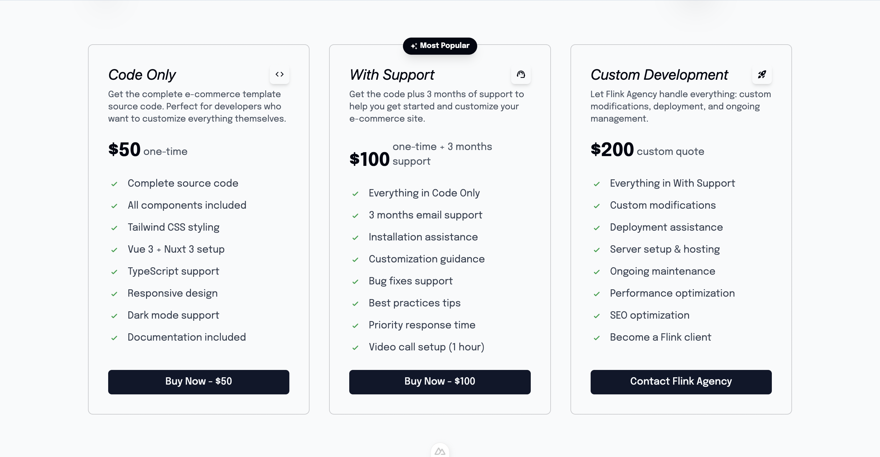
Preview
Basic Usage
<template>
  <section id="pricing">
    <Pricing />
  </section>
</template>

<script setup lang="ts">
import Pricing from '@/components/Pricing.vue'
</script>Features
💰 Integrated Pricing Display
- Uses PricingCard component for pricing details
- Responsive grid layout for multiple plans
- Clear call-to-action buttons
📋 Step-by-Step Instructions
- Three simple steps to get started
- Code snippets for each step
- Progressive disclosure of complexity
🌍 Internationalization
- Full i18n support for all text content
- Translatable pricing descriptions
- Multi-language setup instructions
📱 Responsive Design
- Mobile-first responsive layout
- Stacks vertically on smaller screens
- Optimized text sizing across devices
Component Structure
The component consists of two main sections:
- Header Section - Title and description
- Content Section - Pricing card + Setup steps
<template>
  <div class="flex flex-col items-start justify-center w-full min-h-screen">
    <!-- Header -->
    <div class="flex flex-col items-start justify-center w-full px-4 sm:px-6 md:px-10">
      <h2>{{ $t('pricing.pricing_tag') }}</h2>
      <p>{{ $t('pricing.description') }}</p>
    </div>

    <!-- Content -->
    <div class="flex flex-col lg:flex-row items-center justify-between w-full">
      <!-- Pricing Card -->
      <div class="lg:w-full w-11/12 mb-8 lg:mb-0">
        <PricingCard />
      </div>

      <!-- Setup Steps -->
      <div class="flex flex-col space-y-4 h-full items-start justify-start w-full">
        <!-- Steps 1, 2, 3 -->
      </div>
    </div>
  </div>
</template>Setup Steps
The component includes three hardcoded setup steps:
Step 1: Install ClawPlate
git clone https://github.com/Clawplate/Clawplate.gitStep 2: Build your SaaS
npm installStep 3: Make Money
npm run devInternationalization
All text content uses i18n translation keys:
{
  "pricing": {
    "pricing_tag": "Simple, transparent pricing",
    "description": "Choose the plan that's right for you.",
    "pricing_description_2": "Start building your SaaS today."
  }
}Translation Files
Configure translations in /i18n/locales/:
English (en.json)
{
  "pricing": {
    "pricing_tag": "Simple, transparent pricing",
    "description": "Choose the plan that's right for you.",
    "pricing_description_2": "Start building your SaaS today."
  }
}French (fr.json)
{
  "pricing": {
    "pricing_tag": "Tarification simple et transparente",
    "description": "Choisissez le plan qui vous convient.",
    "pricing_description_2": "Commencez à construire votre SaaS dès aujourd'hui."
  }
}Styling Details
Typography
Uses the Exo 2 font family for modern, clean appearance:
.font-exo-2 {
  font-family: 'Exo 2', sans-serif;
}Responsive Text Sizes
Progressive text sizing for optimal readability:
<!-- Headers -->
<h2 class="text-3xl sm:text-4xl md:text-5xl font-bold font-exo-2">

<!-- Step numbers -->
<h1 class="text-4xl sm:text-5xl md:text-6xl font-exo-2">

<!-- Step titles -->
<h1 class="text-xl sm:text-2xl md:text-3xl font-exo-2">

<!-- Descriptions -->
<p class="text-sm sm:text-base md:text-lg text-gray-500">Layout Classes
min-h-screen- Full viewport height sectionflex-col lg:flex-row- Responsive flex directionspace-y-4- Consistent vertical spacingpx-4 sm:px-6 md:px-10- Responsive horizontal padding
Customization
Updating Setup Steps
Modify the hardcoded steps in the template:
<template>
  <!-- Step 1 -->
  <div class="flex flex-col gap-4 w-full h-auto lg:h-1/3">
    <div class="flex items-end justify-start gap-2 sm:gap-4">
      <h1 class="text-4xl sm:text-5xl md:text-6xl font-exo-2">1.</h1>
      <h1 class="text-xl sm:text-2xl md:text-3xl font-exo-2">Your Custom Step</h1>
    </div>
    <p class="text-sm sm:text-base md:text-lg text-gray-500">
      --your custom command
    </p>
  </div>
</template>Changing Repository URL
Update the GitHub repository URL in step 1:
<p class="text-sm sm:text-base md:text-lg text-gray-500 break-all">
  --git clone https://github.com/YourUsername/YourRepo.git
</p>Adding More Steps
Add additional steps by duplicating the step structure:
<!-- Step 4 -->
<div class="flex flex-col gap-4 w-full h-auto lg:h-1/3">
  <div class="flex items-end justify-start gap-2 sm:gap-4">
    <h1 class="text-4xl sm:text-5xl md:text-6xl font-exo-2">4.</h1>
    <h1 class="text-xl sm:text-2xl md:text-3xl font-exo-2">Deploy</h1>
  </div>
  <p class="text-sm sm:text-base md:text-lg text-gray-500">
    --npm run build && npm run deploy
  </p>
</div>Component Dependencies
PricingCard Component
The Pricing component uses a separate PricingCard component:
<PricingCard />Make sure PricingCard is properly configured with your pricing plans and Stripe integration.
Composables Used
useI18n()
Provides internationalization functionality:
const { t } = useI18n()
// Usage: {{ $t('pricing.pricing_tag') }}ref()
Creates reactive references for component state:
const pricingRef = ref(null)SEO Considerations
Section ID
Add an ID for anchor linking:
<div id="pricing" ref="pricingRef" class="...">Schema Markup
Consider adding structured data for pricing:
<script setup lang="ts">
// Add structured data for pricing
const structuredData = {
  "@context": "https://schema.org",
  "@type": "PriceSpecification",
  "name": "ClawPlate Pricing",
  // ... pricing details
}
</script>Accessibility
Heading Hierarchy
Proper heading structure for screen readers:
<h2>Section Title</h2>
<h3>Step Titles</h3>Color Contrast
Ensure sufficient contrast for text:
- Main text: High contrast on background
- Gray text (
text-gray-500): Meets WCAG guidelines
Keyboard Navigation
All interactive elements (via PricingCard) should be keyboard accessible.
Performance
Template Refs
Uses template refs for potential scroll animations:
<script setup lang="ts">
const pricingRef = ref(null)
// Can be used for intersection observer, scroll animations, etc.
</script>Lazy Loading
Consider lazy loading for enhanced performance:
<template>
  <div v-intersect="handleIntersect">
    <Pricing />
  </div>
</template>Integration Examples
Landing Page Integration
<template>
  <div>
    <HeroComponent />
    <Features />
    <Pricing /> <!-- Pricing section -->
    <Testimonials />
    <Footer />
  </div>
</template>Analytics Tracking
<script setup lang="ts">
const pricingRef = ref(null)

const trackPricingView = () => {
  // Track pricing section view
  gtag('event', 'view_pricing', {
    event_category: 'engagement',
    event_label: 'pricing_section'
  })
}

onMounted(() => {
  // Set up intersection observer for analytics
  const observer = new IntersectionObserver((entries) => {
    if (entries[0].isIntersecting) {
      trackPricingView()
    }
  })

  if (pricingRef.value) {
    observer.observe(pricingRef.value)
  }
})
</script>Related Components
- Features - Feature showcase section
- HeroComponent - Main hero section
- Button - For pricing CTAs
Dependencies
- Nuxt i18n - For internationalization
- Vue 3 - Composition API
- Tailwind CSS - For styling
- PricingCard Component - For pricing display