
HeroText Component
Main hero text component featuring promotional badge, animated title with shadow effects, and descriptive text. Central element of the hero section.
Overview
The HeroText component creates the primary text content for your hero section, including a promotional badge, large animated title, and supporting description text. It uses internationalization and includes visual effects for enhanced engagement.
Preview
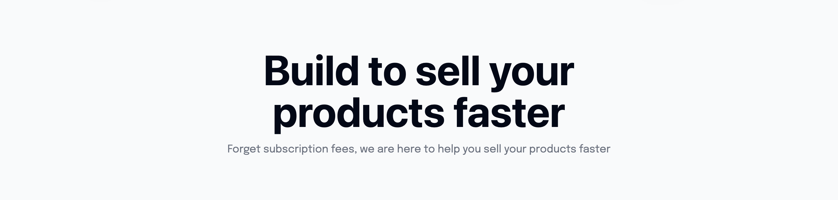
Basic Usage
<template>
  <div class="hero-section">
    <HeroText />
  </div>
</template>

<script setup lang="ts">
import HeroText from '@/components/HeroText.vue'
</script>Features
Promotional Badge
- Green badge with dollar icon
- Limited time offer messaging
- Rounded design with border
Animated Title
- Large responsive typography (4xl to 7xl)
- LineShadowText component integration
- Italic "Faster" emphasis with shadow effects
Description Text
- Supporting description text
- Responsive width (3/4 on mobile)
- Muted color for hierarchy
Internationalization
- Full i18n support for all text content
- Configurable promotional messages
- Multi-language title and description
Component Structure
<template>
  <div class="z-50 flex flex-col items-center justify-center gap-4">
    <!-- Promotional Badge -->
    <span class="promotional-badge">
      <Icon name="bxs:badge-dollar" size="16" />
      <span>{{ $t('heroSection.heroLimitedTimeOfferValue') }}</span>
      <span>{{ $t('heroSection.heroLimitedTimeOffer') }}</span>
    </span>

    <!-- Main Title -->
    <h1 class="lg:text-7xl text-4xl font-bold text-center w-2/3">
      {{ $t('heroSection.heroTitle') }}
      <LineShadowText class="italic" :shadow-color="shadowColor">
        Faster.
      </LineShadowText>
    </h1>

    <!-- Description -->
    <p class="text-lg text-gray-500 w-3/4 text-center">
      {{ $t('heroSection.heroDescription') }}
    </p>
  </div>
</template>Component API
Props
This component doesn't accept props. All content is managed through i18n translations.
Events
No custom events are emitted from this component.
Slots
No slots are available. Content is provided through i18n keys.
Internationalization
Configure hero text in your i18n files:
{
  "heroSection": {
    "heroLimitedTimeOfferValue": "$47",
    "heroLimitedTimeOffer": "Limited Time Offer",
    "heroTitle": "Build Your SaaS",
    "heroDescription": "The fastest way to build and launch your SaaS with modern tools and best practices."
  }
}Translation Examples
English (en.json)
{
  "heroSection": {
    "heroLimitedTimeOfferValue": "$47",
    "heroLimitedTimeOffer": "Limited Time Offer",
    "heroTitle": "Build Your SaaS",
    "heroDescription": "The fastest way to build and launch your SaaS with modern tools and best practices."
  }
}French (fr.json)
{
  "heroSection": {
    "heroLimitedTimeOfferValue": "47€",
    "heroLimitedTimeOffer": "Offre Limitée",
    "heroTitle": "Créez Votre SaaS",
    "heroDescription": "Le moyen le plus rapide de créer et lancer votre SaaS avec des outils modernes."
  }
}Styling Details
Promotional Badge
<span class="text-sm py-2 bg-green-300 px-4 rounded-full h-full flex items-center justify-center gap-2 border border-opacity-20 border-gray-950 text-gray-500">- Green background (
bg-green-300) - Rounded full design (
rounded-full) - Flexbox centered content
- Border with opacity
Typography Hierarchy
<!-- Main title: Large, bold, responsive -->
<h1 class="lg:text-7xl text-4xl font-bold text-center w-2/3">

<!-- Description: Medium, muted, centered -->
<p class="text-lg text-gray-500 w-3/4 text-center">Responsive Design
- Title:
text-4xlon mobile,lg:text-7xlon large screens - Width:
w-2/3for title,w-3/4for description - Centered alignment across all screen sizes
LineShadowText Integration
The component uses LineShadowText for the "Faster" emphasis:
<LineShadowText
  class="italic"
  :shadow-color="shadowColor"
>
  Faster.
</LineShadowText>Shadow Color Configuration
const shadowColor = ref('#your-shadow-color')Customization
Changing the Promotional Badge
<!-- Custom badge content -->
<span class="promotional-badge">
  <Icon name="your-icon" size="16" />
  <span>Your Value</span>
  <span>Your Message</span>
</span>Modifying the Title Structure
<h1 class="title-classes">
  {{ $t('heroSection.heroTitle') }}
  <LineShadowText class="italic">
    Your Emphasis
  </LineShadowText>
</h1>Badge Color Variants
<!-- Blue badge -->
<span class="bg-blue-300 text-blue-700">

<!-- Purple badge -->
<span class="bg-purple-300 text-purple-700">

<!-- Orange badge -->
<span class="bg-orange-300 text-orange-700">Composables Used
useI18n()
Provides internationalization functionality:
const { t } = useI18n()
// Usage: {{ $t('heroSection.heroTitle') }}Accessibility
Semantic HTML
- Uses proper heading hierarchy (
h1for main title) - Descriptive text structure
- Icon with appropriate sizing
Screen Reader Support
- Text content is fully accessible
- Icon provides visual enhancement without blocking content
- Proper reading order maintained
Performance
Lightweight Design
- No heavy animations or complex logic
- Efficient text rendering
- Minimal DOM structure
Lazy Loading Considerations
The component renders immediately as it's above-the-fold content.
Integration Examples
Complete Hero Section
<template>
  <section class="hero-section min-h-screen flex flex-col items-center justify-center">
    <HeroText />
    <HeroButtons />
  </section>
</template>With Background Effects
<template>
  <div class="relative">
    <!-- Background effects -->
    <div class="absolute inset-0 bg-gradient-to-br from-blue-50 to-purple-50"></div>

    <!-- Hero content -->
    <div class="relative z-10">
      <HeroText />
    </div>
  </div>
</template>Related Components
- HeroButtons - Action buttons for hero section
- HeroComponent - Complete hero section wrapper
Dependencies
- Nuxt i18n - For internationalization
- Nuxt Icons - For badge icons
- LineShadowText - For text shadow effects
- Tailwind CSS - For styling