
SecondFeatures Component
Alternative features section with different layout and styling. Perfect for showcasing additional product capabilities or technical specifications.
Overview
The SecondFeatures component provides an alternative way to showcase your product features with a different visual approach than the main Features component. It's ideal for highlighting technical features, integrations, or secondary benefits.
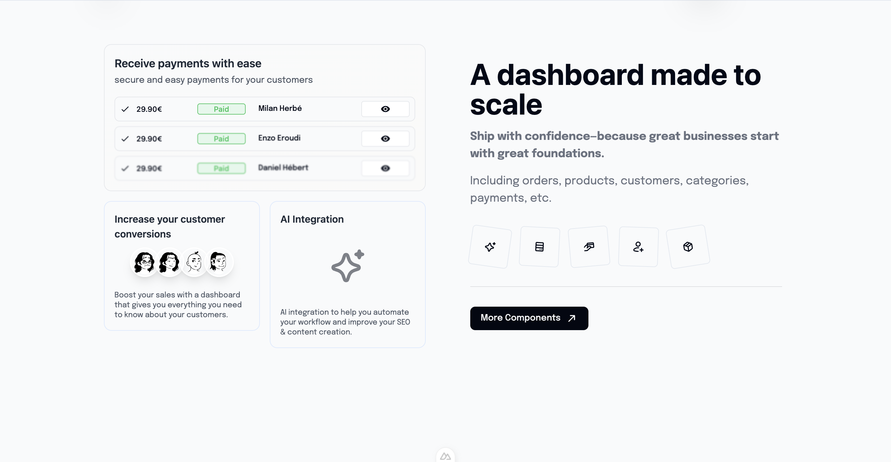
Preview
Basic Usage
vue
<template>
  <section class="features-section">
    <Features />
    <!-- Main features -->

    <SecondFeatures />
    <!-- Additional/technical features -->
  </section>
</template>

<script setup lang="ts">
import SecondFeatures from '@/components/SecondFeatures.vue'
</script>Features
🔧 Technical Focus
- Developer-oriented features
- Integration capabilities
- API documentation highlights
- Technical specifications
🎨 Alternative Layout
- Different visual approach
- Complementary to main Features
- Unique styling patterns
- Flexible grid system
📊 Data Visualization
- Charts and graphs
- Performance metrics
- Usage statistics
- Comparison tables
🔗 Integration Showcase
- Third-party integrations
- API connections
- Workflow demonstrations
- Service partnerships
Component API
Props
| Prop | Type | Default | Description |
|---|---|---|---|
title | string | 'Advanced Features' | Section title |
subtitle | string | undefined | Optional subtitle |
layout | 'grid' | 'list' | 'cards' | 'grid' | Layout variant |
showIcons | boolean | true | Display feature icons |
Data Structure
typescript
interface SecondFeature {
  id: string
  title: string
  description: string
  icon: string
  category: 'technical' | 'integration' | 'performance'
  metrics?: {
    value: string
    label: string
  }
}Layout Variants
Grid Layout
vue
<SecondFeatures layout="grid" />Features displayed in a responsive grid with equal-sized cards.
List Layout
vue
<SecondFeatures layout="list" />Vertical list format with detailed descriptions.
Cards Layout
vue
<SecondFeatures layout="cards" />Card-based design with hover effects and animations.
Feature Categories
Technical Features
- Database performance
- Security measures
- Scalability options
- Development tools
Integration Features
- API capabilities
- Third-party services
- Webhook support
- Import/export tools
Performance Features
- Speed optimizations
- Caching systems
- CDN integration
- Load balancing
Customization
Custom Feature Set
vue
<script setup lang="ts">
const customFeatures = [
  {
    id: 'api-first',
    title: 'API-First Architecture',
    description: 'Built with RESTful APIs and GraphQL support',
    icon: 'heroicons:code-bracket',
    category: 'technical',
    metrics: { value: '99.9%', label: 'Uptime' }
  },
  {
    id: 'integrations',
    title: '50+ Integrations',
    description: 'Connect with your favorite tools and services',
    icon: 'heroicons:puzzle-piece',
    category: 'integration'
  }
]
</script>

<template>
  <SecondFeatures :features="customFeatures" />
</template>Styling Themes
vue
<!-- Dark theme -->
<SecondFeatures theme="dark" />

<!-- Minimal theme -->
<SecondFeatures theme="minimal" />

<!-- Technical theme -->
<SecondFeatures theme="technical" />Integration Examples
With Performance Metrics
vue
<script setup lang="ts">
const { data: metrics } = await $fetch('/api/performance-metrics')

const performanceFeatures = computed(() => [
  {
    title: 'Lightning Fast',
    description: 'Optimized for speed and performance',
    metrics: { value: `${metrics.loadTime}ms`, label: 'Load Time' }
  },
  {
    title: 'Highly Available',
    description: 'Enterprise-grade reliability',
    metrics: { value: `${metrics.uptime}%`, label: 'Uptime' }
  }
])
</script>With Real-time Data
vue
<script setup lang="ts">
const { data: liveStats } = await $fetch('/api/live-stats', {
  server: false // Client-side only for real-time data
})

const statsFeatures = computed(() => [
  {
    title: 'Active Users',
    metrics: { value: liveStats.activeUsers, label: 'Online Now' }
  },
  {
    title: 'API Requests',
    metrics: { value: liveStats.apiRequests, label: 'Per Second' }
  }
])
</script>Animation Support
Scroll Animations
vue
<script setup lang="ts">
const sectionRef = ref(null)
const { $gsap } = useNuxtApp()

onMounted(() => {
  $gsap.from(sectionRef.value.children, {
    y: 50,
    opacity: 0,
    duration: 0.8,
    stagger: 0.2,
    scrollTrigger: sectionRef.value
  })
})
</script>Hover Effects
- Card lift animations
- Icon rotations
- Color transitions
- Shadow enhancements
SEO Optimization
Structured Data
vue
<script setup lang="ts">
const featureSchema = {
  "@context": "https://schema.org",
  "@type": "ItemList",
  "itemListElement": features.map((feature, index) => ({
    "@type": "ListItem",
    "position": index + 1,
    "name": feature.title,
    "description": feature.description
  }))
}
</script>Accessibility
Screen Reader Support
- Proper heading hierarchy
- Descriptive alt text
- ARIA labels for metrics
- Semantic HTML structure
Keyboard Navigation
- Tab order management
- Focus indicators
- Skip links
- Keyboard shortcuts
Related Components
- Features - Main features section
- BentoGrid - Alternative grid layout
- Testimonials - Customer feedback
- Pricing - Pricing information