
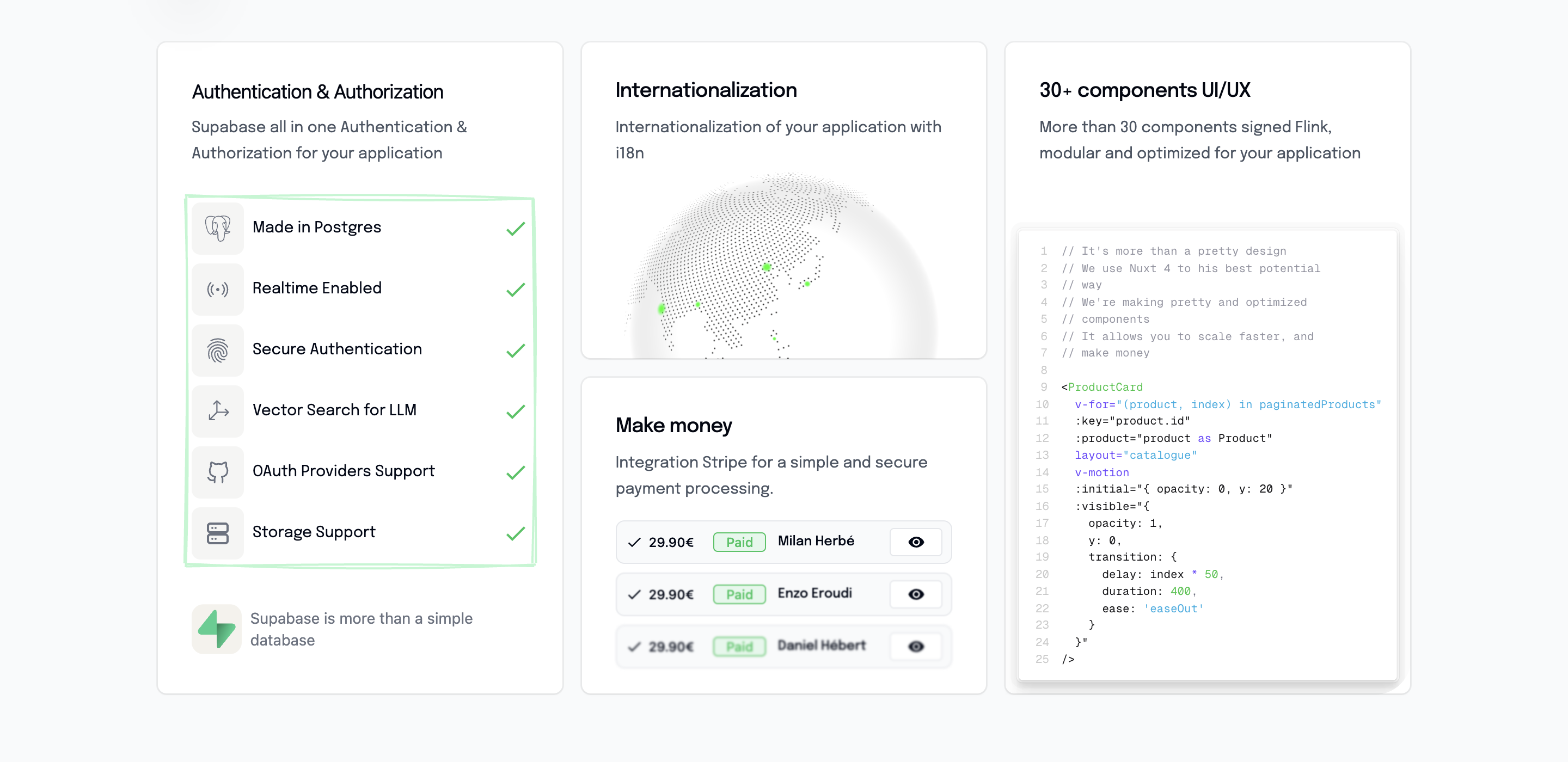
BentoGrid Component
Modern grid layout component showcasing product features in an elegant bento-box style layout. Perfect for highlighting key capabilities and technical specifications.
Overview
The BentoGrid component creates a visually appealing grid layout that showcases different aspects of your product. It uses a masonry-style layout with varying card sizes to create visual interest and highlight important features.
Preview
Basic Usage
vue
<template>
  <section class="py-16">
    <BentoGrid />
  </section>
</template>

<script setup lang="ts">
import BentoGrid from '@/components/BentoGrid.vue'
</script>Features
🏗️ Flexible Grid Layout
- CSS Grid with responsive columns
- Variable row spans for visual hierarchy
- Mobile-optimized stacking
✅ Feature Showcase
- Database capabilities (PostgreSQL)
- Real-time functionality
- Security features
- AI/Vector search integration
- GitHub integration
🎨 Visual Design
- Clean white cards with subtle shadows
- Icon-based feature representation
- Consistent spacing and typography
- Responsive design patterns
🌍 Internationalization
- Full i18n support for all text content
- Translatable feature descriptions
- Multi-language compatibility
Component Structure
vue
<template>
  <div class="bg-gray-50">
    <div class="grid gap-4 lg:grid-cols-3 lg:grid-rows-2">

      <!-- Main Feature Card (spans 2 rows) -->
      <div class="relative lg:row-span-2">
        <div class="feature-list">
          <!-- Database Features -->
          <div class="feature-item">
            <Icon name="simple-icons:postgresql" />
            <p>Made in Postgres</p>
            <Icon name="mdi:check" class="text-green-500" />
          </div>

          <!-- Additional features... -->
        </div>
      </div>

      <!-- Secondary Cards -->
      <div class="grid-card">
        <!-- Card content -->
      </div>

    </div>
  </div>
</template>Grid Layout Structure
Desktop Layout (lg:grid-cols-3 lg:grid-rows-2)
┌─────────────┬─────────┬─────────┐
│             │  Card 2 │  Card 3 │
│   Main      ├─────────┼─────────┤
│   Features  │  Card 4 │  Card 5 │
│   (2 rows)  │         │         │
└─────────────┴─────────┴─────────┘Mobile Layout
Cards stack vertically with responsive ordering using CSS order property.
Featured Capabilities
Database Features
vue
<div class="feature-item">
  <Icon name="simple-icons:postgresql" />
  <p>Made in Postgres</p>
  <Icon name="mdi:check" class="text-green-500" />
</div>- PostgreSQL Integration - Robust database foundation
- Real-time Enabled - Live data synchronization
- Secure Authentication - Built-in security features
- Vector Search for LLM - AI-ready search capabilities
- GitHub Integration - Version control integration
Visual Elements
- Icons - Technology and feature icons
- Check Marks - Green checkmarks for completed features
- Consistent Styling - Uniform card design
- Responsive Icons - Scalable icon sizes
Styling Details
Card Structure
vue
<div class="relative lg:row-span-2">
  <!-- Background -->
  <div class="absolute inset-px rounded-lg bg-white lg:rounded-l-4xl" />

  <!-- Content Container -->
  <div class="relative flex h-full flex-col overflow-hidden rounded-[calc(var(--radius-lg)+1px)]">
    <!-- Content -->
  </div>
</div>Feature Item Layout
vue
<span class="flex items-center gap-2 w-full justify-between">
  <!-- Icon and Text -->
  <div class="flex items-center gap-2">
    <span class="bg-stone-100 w-8 h-8 sm:w-12 sm:h-12 rounded-lg flex items-center justify-center">
      <Icon name="icon-name" class="w-4 h-4 sm:w-6 sm:h-6 text-gray-500" />
    </span>
    <p class="text-xs sm:text-sm">Feature Name</p>
  </div>

  <!-- Check Mark -->
  <Icon name="mdi:check" class="w-4 h-4 sm:w-6 sm:h-6 text-green-500" />
</span>Responsive Design
vue
<!-- Container -->
<div class="px-4 sm:px-8 lg:px-8 pt-6 pb-3 sm:pt-6 sm:pb-0">

<!-- Icons -->
<Icon class="w-4 h-4 sm:w-6 sm:h-6" />

<!-- Text -->
<p class="text-xs sm:text-sm">Internationalization
Configure bento grid content in your i18n files:
json
{
  "bentoGrid": {
    "bentoGrid_2": "Powerful Database Features",
    "bentoGrid_2_description": "Built on PostgreSQL with advanced features for modern applications"
  }
}Translation Examples
English (en.json)
json
{
  "bentoGrid": {
    "bentoGrid_2": "Powerful Database Features",
    "bentoGrid_2_description": "Built on PostgreSQL with advanced features for modern applications",
    "feature_postgres": "Made in Postgres",
    "feature_realtime": "Realtime Enabled",
    "feature_auth": "Secure Authentication",
    "feature_vector": "Vector Search for LLM",
    "feature_github": "GitHub Integration"
  }
}French (fr.json)
json
{
  "bentoGrid": {
    "bentoGrid_2": "Fonctionnalités de Base de Données Puissantes",
    "bentoGrid_2_description": "Construit sur PostgreSQL avec des fonctionnalités avancées",
    "feature_postgres": "Fait avec Postgres",
    "feature_realtime": "Temps Réel Activé",
    "feature_auth": "Authentification Sécurisée",
    "feature_vector": "Recherche Vectorielle pour LLM",
    "feature_github": "Intégration GitHub"
  }
}Customization
Adding New Features
vue
<span class="flex items-center gap-2 w-full justify-between">
  <div class="flex items-center gap-2">
    <span class="bg-stone-100 w-8 h-8 sm:w-12 sm:h-12 rounded-lg flex items-center justify-center">
      <Icon name="your-custom-icon" class="w-4 h-4 sm:w-6 sm:h-6 text-gray-500" />
    </span>
    <p class="text-xs sm:text-sm">{{ $t('bentoGrid.your_feature') }}</p>
  </div>
  <Icon name="mdi:check" class="w-4 h-4 sm:w-6 sm:h-6 text-green-500" />
</span>Changing Grid Layout
vue
<!-- 4 columns instead of 3 -->
<div class="grid gap-4 lg:grid-cols-4 lg:grid-rows-2">

<!-- Different row spans -->
<div class="relative lg:row-span-3">

<!-- Add more rows -->
<div class="grid gap-4 lg:grid-cols-3 lg:grid-rows-3">Custom Card Themes
vue
<!-- Blue theme -->
<div class="absolute inset-px rounded-lg bg-blue-50">

<!-- Dark theme -->
<div class="absolute inset-px rounded-lg bg-gray-900">
  <p class="text-white">Content</p>
</div>Template References
The component uses template refs for potential animations:
typescript
const bentoGridRef = ref(null)
const featuresRef = ref(null)These can be used for:
- Intersection observer animations
- Scroll-triggered effects
- Dynamic content loading
Animation Opportunities
Scroll Animations
vue
<script setup lang="ts">
import { useIntersectionObserver } from '@vueuse/core'

const bentoGridRef = ref(null)
const isVisible = ref(false)

useIntersectionObserver(bentoGridRef, ([{ isIntersecting }]) => {
  isVisible.value = isIntersecting
})
</script>

<template>
  <div
    ref="bentoGridRef"
    :class="{ 'animate-fade-in': isVisible }"
  >
    <!-- Content -->
  </div>
</template>Staggered Feature Animations
vue
<div
  v-for="(feature, index) in features"
  :key="feature.id"
  :style="{ animationDelay: `${index * 100}ms` }"
  class="feature-item animate-slide-up"
>Accessibility
Semantic Structure
vue
<section aria-labelledby="features-title">
  <h2 id="features-title" class="sr-only">Product Features</h2>

  <div class="grid" role="list">
    <div class="feature-item" role="listitem">
      <!-- Feature content -->
    </div>
  </div>
</section>Icon Accessibility
vue
<Icon
  name="simple-icons:postgresql"
  aria-label="PostgreSQL database"
  class="w-6 h-6"
/>Performance
Efficient Rendering
- Static content with minimal JavaScript
- CSS Grid for optimal layout performance
- Optimized icon loading
Image Optimization
If adding images to cards:
vue
<NuxtImg
  src="/feature-image.jpg"
  alt="Feature description"
  loading="lazy"
  class="w-full h-auto"
/>Integration Examples
With Animation Library
vue
<template>
  <div
    ref="bentoGridRef"
    class="bg-gray-50"
    data-aos="fade-up"
    data-aos-duration="800"
  >
    <!-- Grid content -->
  </div>
</template>With Dynamic Content
vue
<script setup lang="ts">
const { data: features } = await useFetch('/api/features')
</script>

<template>
  <div class="feature-list">
    <div
      v-for="feature in features"
      :key="feature.id"
      class="feature-item"
    >
      <Icon :name="feature.icon" />
      <p>{{ feature.name }}</p>
      <Icon name="mdi:check" class="text-green-500" />
    </div>
  </div>
</template>Related Components
- Features - Alternative features showcase
- Testimonials - Customer testimonials
- Pricing - Pricing section
- HeroComponent - Hero section
Dependencies
- Nuxt Icons - For feature and check icons
- Nuxt i18n - For internationalization
- Vue 3 - Composition API and template refs
- Tailwind CSS - For grid layout and styling